Showing posts with label Type2. Show all posts
Showing posts with label Type2. Show all posts
Sunday, April 27, 2014
Monday, April 21, 2014
Friday, April 18, 2014
Monday, April 7, 2014
Type Tool
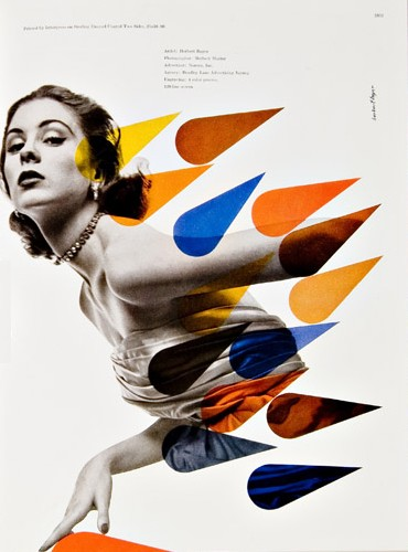
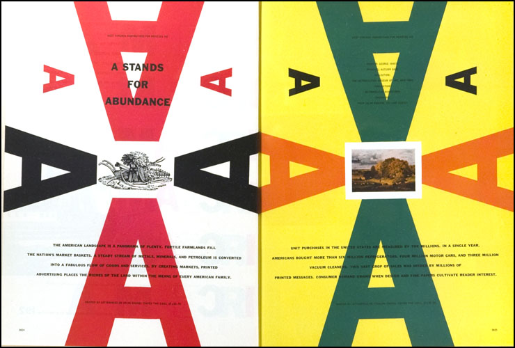
With the composition I used letterforms as images utilizing its form for directional lines. My designer Bradbury Thompson was known for his unique way of using the cmyk color pallet in his designs. He also used letterforms to create visually aesthetic structures throughout his work. These are the atributes that help me create this piece.

Flyers: front / back
Motion graphic home: On projector inside Vanderslice before lecture starts.
Labels:
Type2
Monday, March 31, 2014
Friday, March 28, 2014
Tuesday, March 25, 2014
Friday, March 14, 2014
Monday, March 10, 2014
Friday, March 7, 2014
Monday, March 3, 2014
Sunday, March 2, 2014
Bradbury Thompson
Bradbury Thompson (1911-1995) was truly one of
the giants of 20th-century graphic design, and was recognized for
his achievements by every major American design organization: National Society
of Art Directors of the Year Award (1950), AIGA Gold Medal Award (1975), Art
Directors Hall of Fame (1977) In 1983, he received the Frederic W. Goudy Award
from RIT. He was born in 1911 in
Topeka, where he attended Washburn College, graduating in 1934. After a brief
period as a designer at Capper Publications, where he thoroughly learned every
aspect of printing production, Thompson moved to New York in 1938. Over the
next sixty-some years he unfurled an astonishing talent and embraced every
graphic design opportunity he could. He worked as art director at the
Rogers-Kellogg-Stillson printing firm and then at Mademoiselle magazine, consulted and designed for
Westvaco Corporation, designed a new alphabet, and began a teaching career at
Yale University, where he stayed for many years.
His career was marked by many triumphs, but three stand out prominently as exemplars of his versatility. As the designer of more than 60 issues (1939-62) ofWestvaco Inspirations, a promotional magazine published by the Westvaco Paper Corporation, he reached many thousands of typographers, print buyers, and students. He had an uncanny ability to merge and blend modernist typographic organization with classic typefaces and historic illustrations, all seasoned with affectionate sentiment and impeccable taste. Working with modest resources, he saw himself as teacher and guide:
"The art of typography, like architecture, is concerned with beauty and utility in contemporary terms... the typographic designer must present the arts and sciences of past centuries as well as those of today... And although he works with the graphics of past centuries, he must create in the spirit of his own time, showing in his designs an essential understanding rather than a labored copying of past masters." (from Westvaco Inspirations 206, 1956).
Another triumph came with the publication of The Washburn College Bible, the most monumental and innovative reassessment of bible typography since Gutenberg's own edition appeared in 1455. Some ten years in the making, the WCB presented the text in cadenced phrases, such that its meaning for both reader and listener was conveyed through typography. Set in Jan Tschichold's Renaissance-flavor typeface Sabon and featuring chapter openings with beautiful reproductions of paintings based on biblical stories, the WCB respects the long and inspiring history of this sacred Christian text even as it breaks new ground.
A third area of interest was contemporary postage stamp design. Though credited officially with more than 90 stamps of his own, he consulted with the U.S. Postal Service in guiding the design of many others. Many of his designs became iconic snapshots of American history and culture, including the famous "Learning never ends" stamp of 1980 with its colorful Josef Albers painting, and the irrepressibly jaunty "Love" stamp of 1984.
Quote : "Type can be a tool, toy, and teacher"His career was marked by many triumphs, but three stand out prominently as exemplars of his versatility. As the designer of more than 60 issues (1939-62) ofWestvaco Inspirations, a promotional magazine published by the Westvaco Paper Corporation, he reached many thousands of typographers, print buyers, and students. He had an uncanny ability to merge and blend modernist typographic organization with classic typefaces and historic illustrations, all seasoned with affectionate sentiment and impeccable taste. Working with modest resources, he saw himself as teacher and guide:
"The art of typography, like architecture, is concerned with beauty and utility in contemporary terms... the typographic designer must present the arts and sciences of past centuries as well as those of today... And although he works with the graphics of past centuries, he must create in the spirit of his own time, showing in his designs an essential understanding rather than a labored copying of past masters." (from Westvaco Inspirations 206, 1956).
Another triumph came with the publication of The Washburn College Bible, the most monumental and innovative reassessment of bible typography since Gutenberg's own edition appeared in 1455. Some ten years in the making, the WCB presented the text in cadenced phrases, such that its meaning for both reader and listener was conveyed through typography. Set in Jan Tschichold's Renaissance-flavor typeface Sabon and featuring chapter openings with beautiful reproductions of paintings based on biblical stories, the WCB respects the long and inspiring history of this sacred Christian text even as it breaks new ground.
A third area of interest was contemporary postage stamp design. Though credited officially with more than 90 stamps of his own, he consulted with the U.S. Postal Service in guiding the design of many others. Many of his designs became iconic snapshots of American history and culture, including the famous "Learning never ends" stamp of 1980 with its colorful Josef Albers painting, and the irrepressibly jaunty "Love" stamp of 1984.
Similarities : We share the motivation to learning new things and finding ways to innovate.
Legendary : For working with inventive four color process plate, old engravings, using letterforms as graphic elements. Also combining typography and photography.


v-slice
Labels:
Type2
Subscribe to:
Posts (Atom)


